When you send an email, you are entering the personal space of your users. That space is already filled with emails from friends, families, and other marketers. Thus, you need to have a valuable, relevant, and compelling email design to stand out among such emails.
In other words, if you want to be successful in email marketing, a good email design is indispensable.
But, where do you start since designing an email is not easy-peasy lemon squeezy. To help you, we created this email design guide which will cover components of email design, best practices, and trends.
Table of contents
- What’s an email design?
- Importance of an email design
- Configuration of email design components
- Components of email design
- Responsive email design
- Email design trends in 2022
- Email design best practices
- Final thoughts
What’s an email design?
An email design is a process of creating and arranging different email elements that resonate with your users. In today’s time, email design has become crucial to the success of an email marketing campaign of an organization.
For example, when decorating a home, an interior designer looks for the dimensions, color schemes, layout, arrangements of furniture, and much more. Designing an email is exactly like that.
Importance of an email design
Email design matters because of the following reason:
Better tracking of email metrics such as click-through rates. It is due to the inclusion of interactive elements in email design.
With personalization, you can create a valuable and engaging experience for your users. This will further help in creating brand awareness.
Adding social media buttons in the footer can increase traffic on these platforms.
Prominent and highlighted links can compel users to click and take the desired action. Hence, boosting click-through and email conversion rate.
Configuration of email design components
While designing an email, you can use these configurations to make email components look more engaging and attractive to users.
| Elements | Meaning |
|---|---|
| Alignment Common | It refers to the positioning of elements in email. Alignments can be: |
| Border width | The width of all four sides of an element's border is the border width. The four sides are left, right, top, and bottom. When the value of one side changes, it applies to other sides also. |
| Border radius | With a border radius, you can adjust the roundness of corners of an element. The higher the radius value, the elements will get more round corners. |
| Padding | Padding creates space around an element's content inside any defined borders. The value of padding remains in pixels (px). |
Components of email design
Let's discuss essential components of an email that must be designed well to ensure better engagement and interactivity.
• Email layout
The layout provides structure and flow to the whole email. Every element is arranged to make the email scannable and easy. With Mailmodo, you can create a variety of email layouts such as:
- Single column layout
- Multiple-column layout
- Hybrid layout
- Inverted pyramid layout
- Zig-zag layout
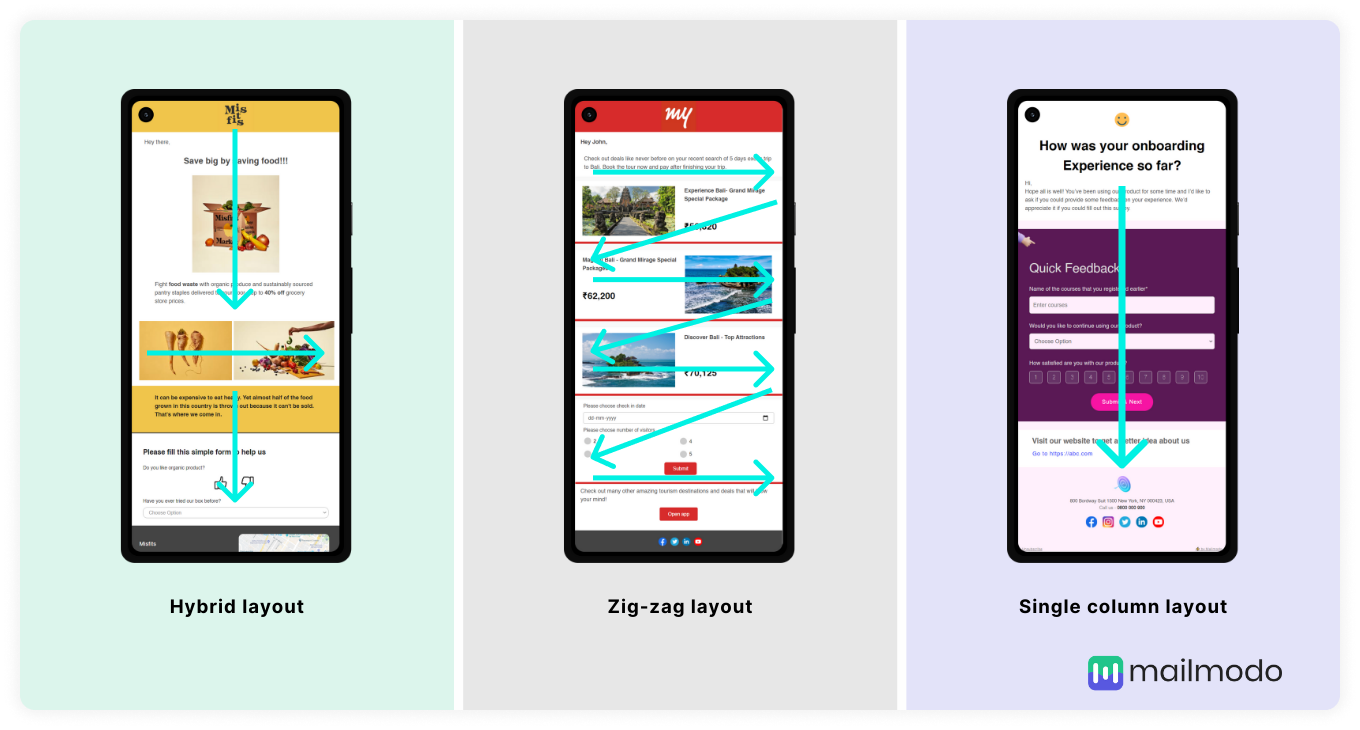
To know how to create a smooth and structured email design layout, you can read An Ultimate Guide to Email Design Layout.
• Text
Text is the descriptive part of an email design. Anything a user can read out loud is the text. While writing a text, you can add formatting adjust the font type, color, size, etc., to highlight the important part of your text.
You can add text using different formatting such as:
- Heading
- Subheading
- Paragraph
- Bullet list
- Numbered list
- List with icons
• Images
Images help in grabbing users’ attention. They provide a visual context to your content, and thus, users are likely to engage more.
In Mailmodo, some of the images you can add are:
- Images relevant to your email content
- Brand logo
- Social media images
While creating an image, you can adjust the size of the image and add an alt text. Alt-text is an HTML attribute that can be added to an image so that if the picture doesn’t render in emails, users can still know what the image is about.
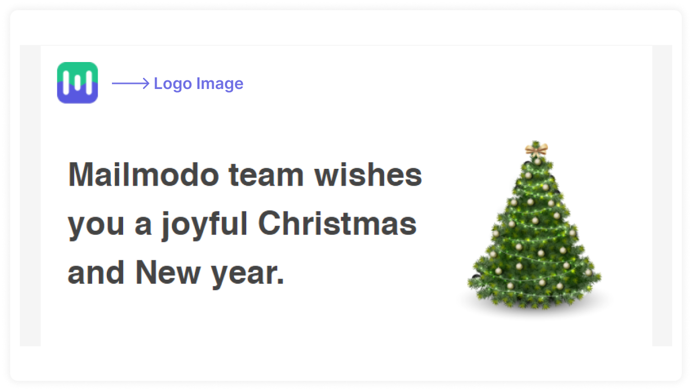
In this example of a holiday email sent out by Mailmodo, their logo is at the top of the email and is easily recognizable. Include your brand logo brand name in the email in a prominent position to locate and tell users who the sender is quick.
• Buttons
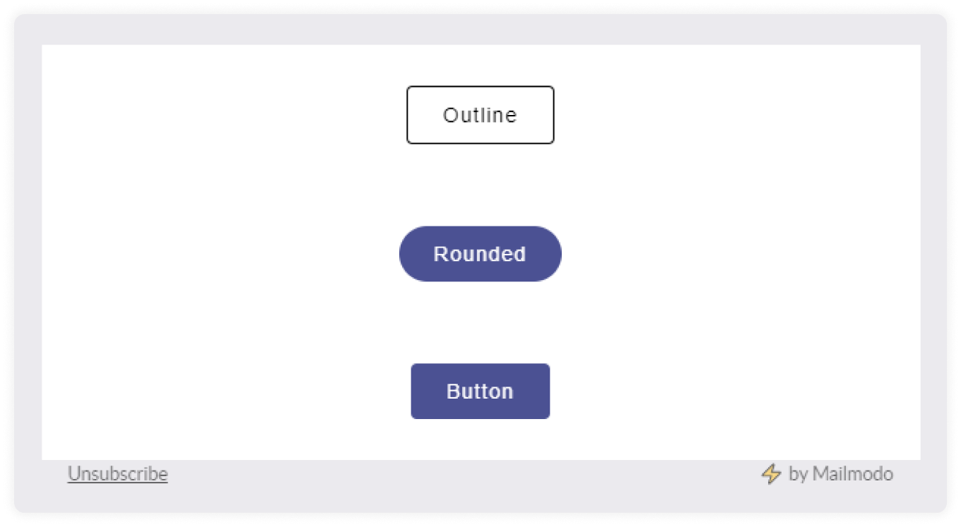
Buttons are the clickable element of an email that reflects your email's CTA. In Mailmodo, you can create three different kinds of buttons:
Outline
Rounded
Square shapes
Learn more about email CTA buttons - How a Strong Call to Action Can Get More Clicks.
• Forms
Forms collect users’ feedback or gather general data for other marketing campaigns. In Mailmodo, you can add different forms such as simple forms, lead generation, NPS, webinars, surveys, etc.
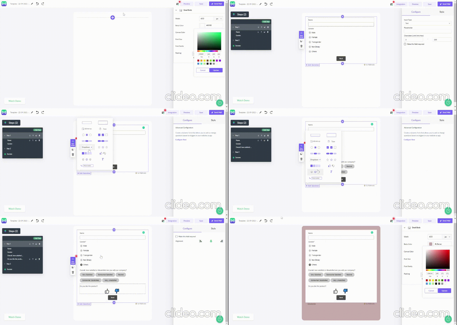
Let's create a form in Mailmodo:
Select the kind of form you want to create.
Then, add all the relevant questions.
If you want users to fill a particular question, then mark it as required.
Use dropdown menu - it allows users to select an option out of various alternatives.
Input type - You can use radio/checkbox or chip.
Read in detail - How to Create Interactive Market research Forms with Mailmodo?
• Email signature
Just like you sign a manually written letter, you can add your signature in the emails also. An email signature is just above the email footer. It is not mandatory to have an email signature but adding the signature can reflect your professionalism and help you stand out from your competitors.

Learn more about email signatures - A Guide on How to End Your Email.
• Email footer
The last section of the email is known as the footer. The email footer contains the sender’s contact details, privacy policy, unsubscribe button, and social share buttons. This part of the email usually remains similar in all emails, but you can customize it.
An example of an email footer by Mailmodo:

Read in detail: What Is Email Footer and How To Use It to Your Advantage in 2022.
These components may render differently since people use different devices, browsers, and operating systems. So, a well-designed email may look good on mobile but may not render well on a desktop. So, how do you make sure that doesn’t happen? The solution lies in creating a responsive email design.
Responsive email design
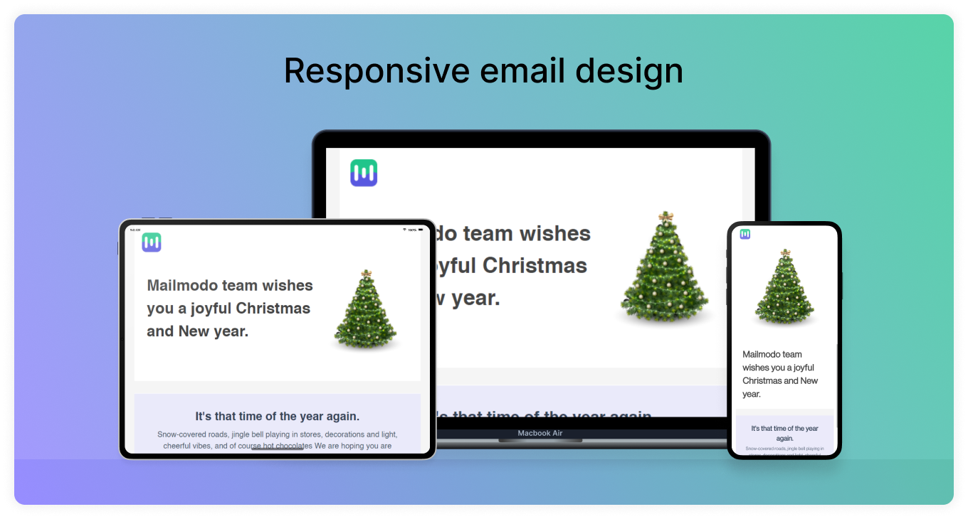
A responsive email design means an email that provides an optimal viewing experience across mobile, desktop, and tablets. How? Using CSS elements such as fluid images, media queries, and flexible images. These elements control the layout and structuring of the email, adapting itself to the user's preferred device.
Why responsive email design is important?
To answer this question, let's look at some statistical data:
41.9% of email opens happened on mobile during Q1 2019, followed by desktop opens at 18.2%. – Litmus
A Mobile-responsive email design can improve unique mobile clicks by 15%. - MailChimp, 2019
Responsive email design usage increased to 50% in June 2016. This was 41% in June 2015 and 26% in June 2014. – Litmus and Salesforce Marketing cloud, 2016
26.6% of recipients find "how it fits my screen" an essential element of email design. – 250OK and 42labs, 2018
These statistics paint a clear picture of why email designers should focus on making their emails responsive. This will improve open and click-through rates and create a better user experience.
Related guide: 11 Must-Know Mobile Email Design Tips to Keep Your Subscribers Happy
Email design trends in 2022
Taking advantage of ongoing trends can help boost your email marketing campaign by providing users with the latest and trendy emails.
Here are some of the email design trends you can take advantage of in 2022:
Interactive AMP emails
AMP emails are changing the email experience for users in the 21st century. Antony Malone, Senior Product Owner Direct Marketing at Booking.com, says,
"It's the biggest thing happening to email since the creation of email."
AMP for email was launched by google in 2019 to create a faster and better user experience when compared to HTML emails. AMP is an upgraded version of HTML tag backed by JavaScript that easily enables functionality with an added focus on performance and security.
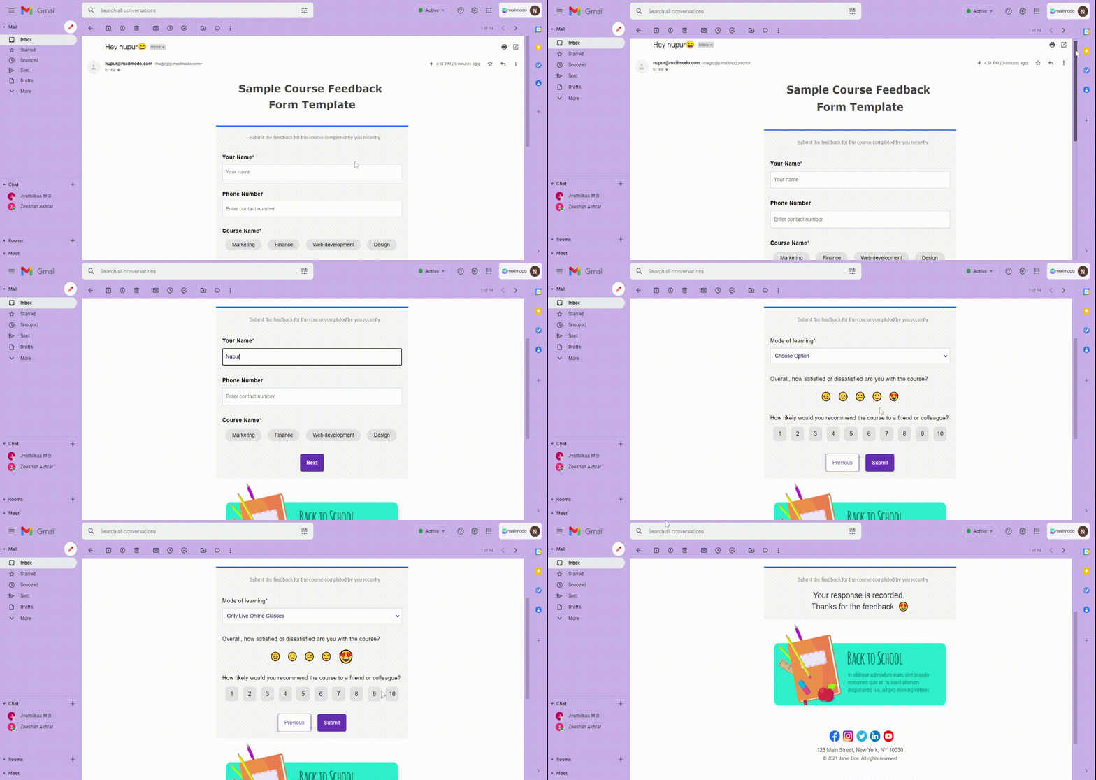
With AMP emails, you can create a website-like experience within the user’s inbox. Thus, enabling interactivity and functionality.
For example, this AMP template by Mailmodo allows users to fill out the form within their inboxes.
Dark mode
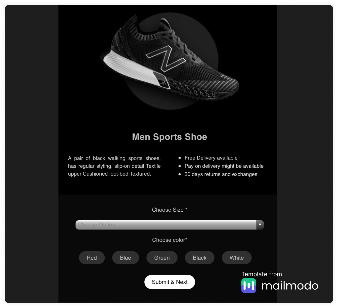
The dark mode (or night mode) is gaining popularity worldwide, and most operating systems allow this feature. With increased average screen time, dark mode provides relief to the eyes. Moreover, it also offers much depth and dimensionality to the email.
For example, look at this dark mode template by Mailmodo:
Read our guide on dark mode to know in detail.
Action-based animations
Many brands are using animation to delight the readers by creating a compelling and action-oriented email design. Besides, by adding GIFs in the email, you can show off your products in a simplified manner.
For example, Lyft uses animated GIFs to tell users about the product update in an engaging way.
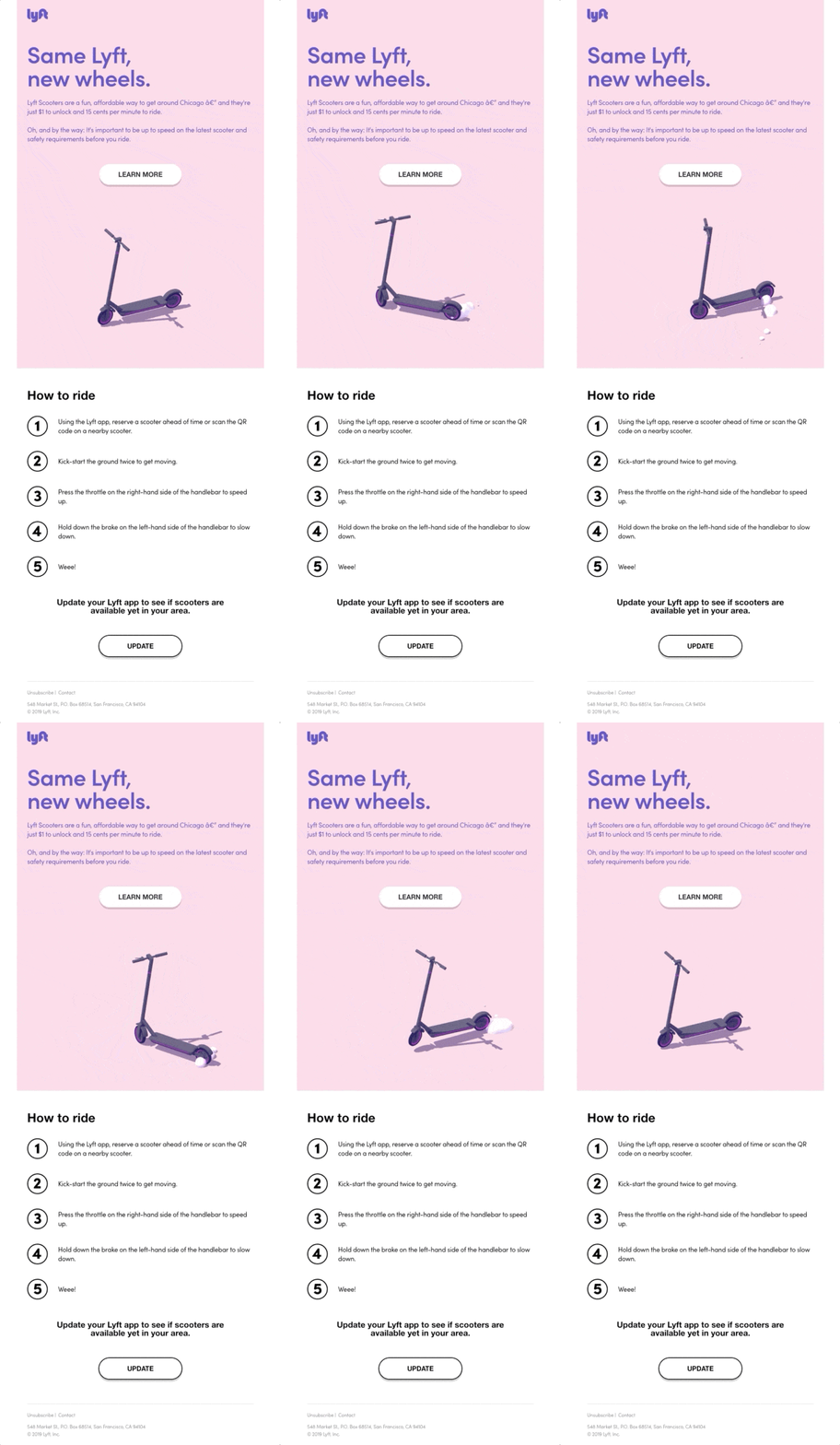
Image credit: Really Good Emails
Read our guide to know How to use GIFs in your email marketing campaigns.
Minimalist email design
Minimalism is the new email design trend gaining popularity because such email design makes the email look impactful yet straightforward. Minimal email design can make emails look polished and compelling by creating an unsophisticated user experience.
For example, see this email by Koio with no product description, no image gallery, just the review, but it still looks so impactful.
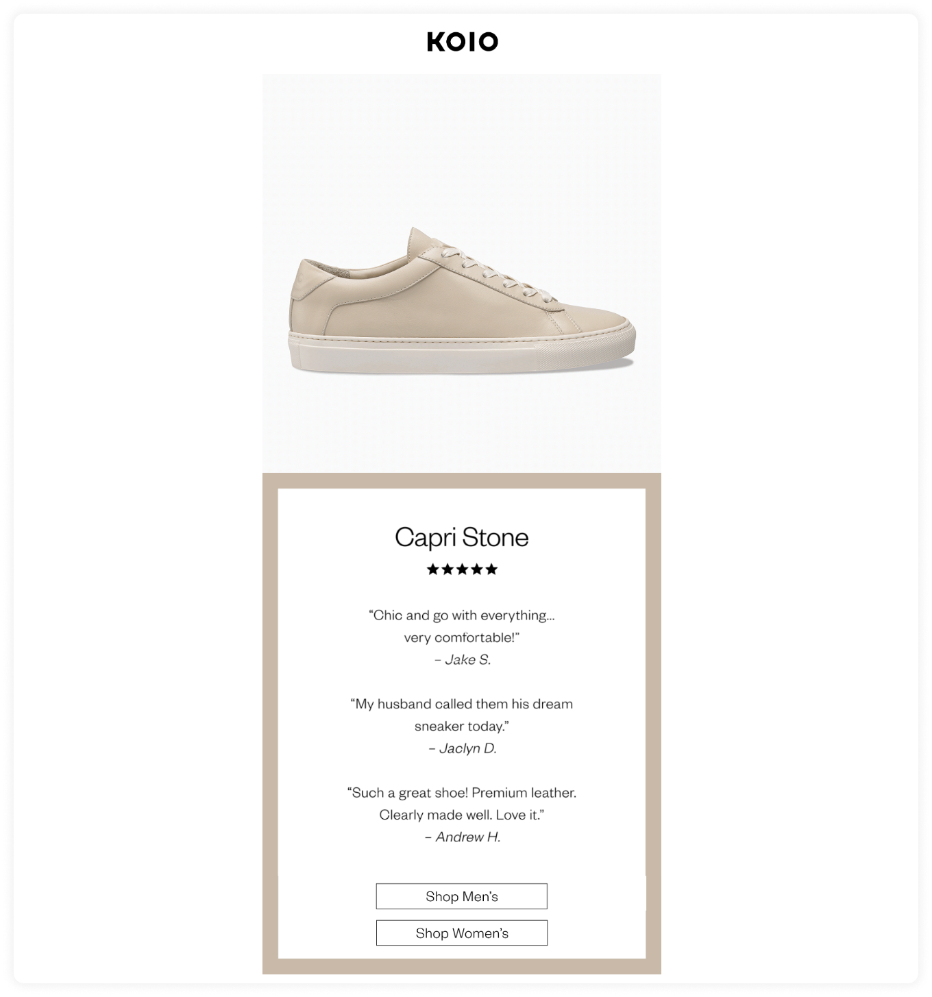
Image credits - Email design & more
Bold and curvy typography
Bold and creative fonts have been in use for a long time, and they are not going anywhere. Why? Because bold fonts can get users’ attention at a glance.
Look at how Quizlet used bigger fonts to highlight its message and a much simpler form to provide details about the offer.
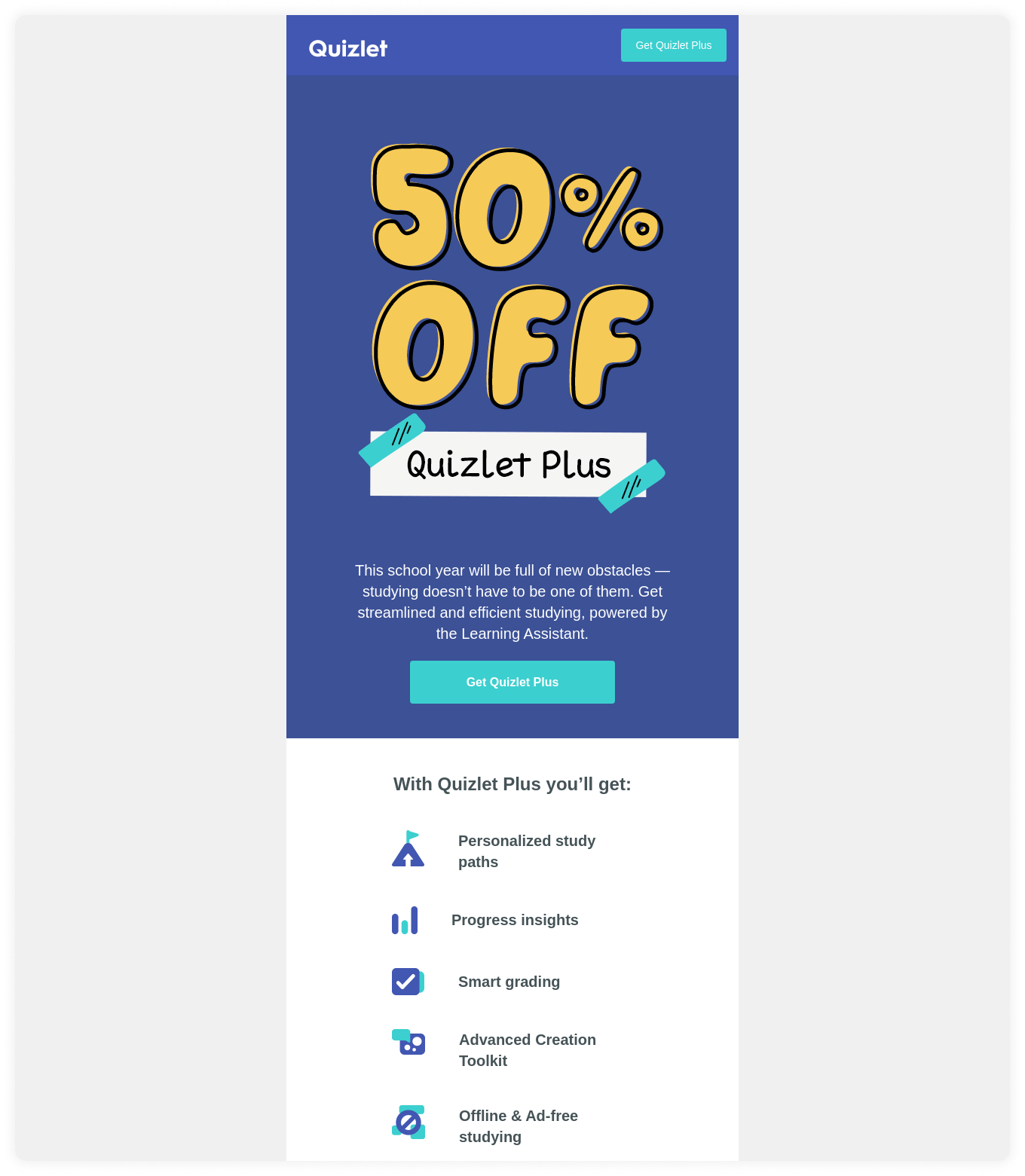
Image credits - Really Good Emails
Creative illustrations
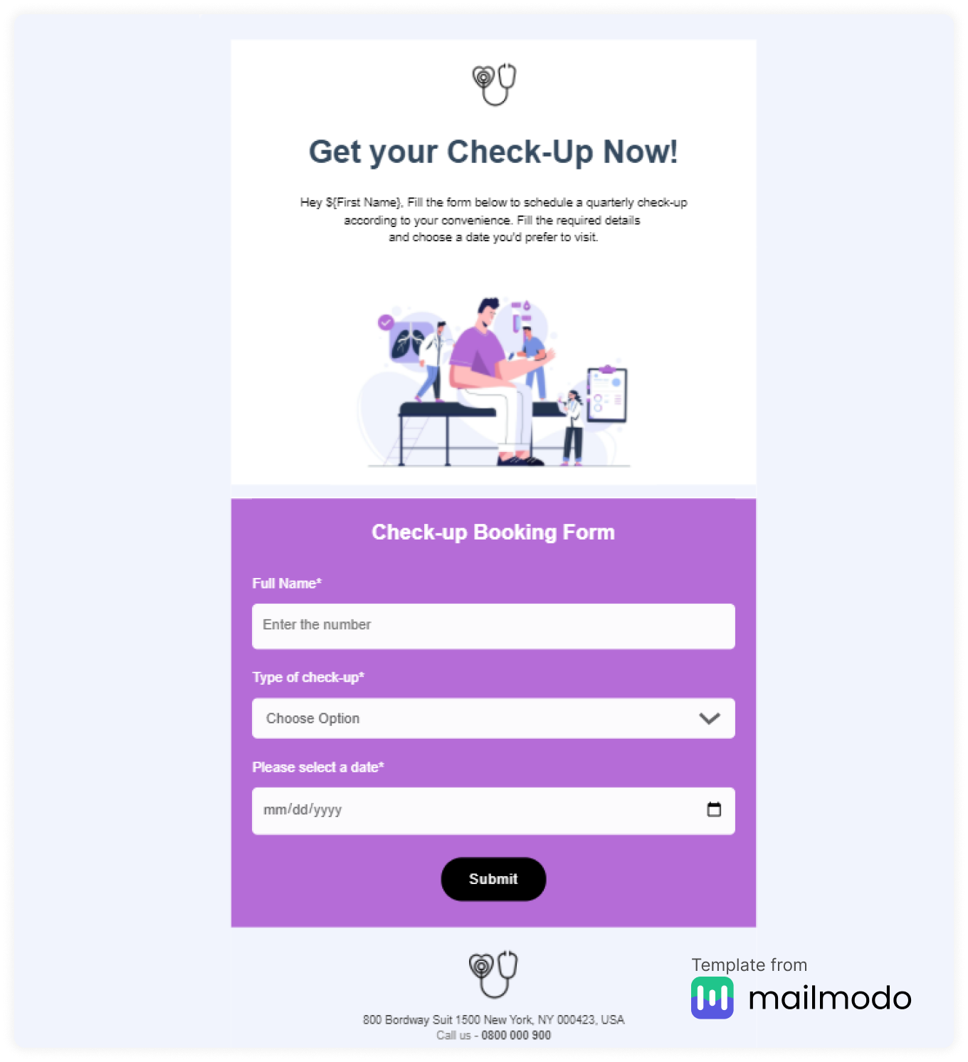
Illustrations are getting used all over the email world. This is because illustration can quickly present your content engagingly and interactively.
For example, the illustration tells the user to book their medical checkup in this template.
Email design best practices
Here are some email design best practices you can follow:
✅ Don’t make the logo too big; always keep white space on the left and right and position it at the top.
✅ Use margin for typography.
✅ Save images as PNG, GIF, or JPG instead of SVG.
✅ Make sure your buttons are large enough to accommodate users. Apple’s guidelines say 44 pixels when designing buttons, and Google calls for 48 pixels, so keep that in mind.
✅Keep the font size 16 pixels at a minimum. And for desktops, 20 pixels is ideal.
✅ Keep the image size short, within dimensions, and responsive. Add alt text to figure out what the image is all about if images do not load.
✅ Avoid “click here” or “learn more” links in the email copy.
✅ A/b test different elements of email design such as email layout, CTA, images or no images, etc.
✅ Create a plain text version of every email.
✅ Always create a responsive design for your emails.
Final thoughts
Email is on the brink of becoming a far more powerful medium , one that will allow email designers to curate all types of media right inside users’ more fully evolved inboxes.
Matthew Smith, Founder, Really Good Emails.
That statement reveals a powerful message about the future of email design and its value. Platforms like Mailmodo are trying to accelerate the email design by providing AMP emails that allow a seamless user experience. We provide various email templates to try, and if you sign up with us, you get a one-month free trial with unlimited credits.

