When you enter a grocery store the first thing you notice is the way all the products are laid out in such a way that you know where to go after your entry. And you are able to find what you are looking for with ease.
This is no accident. The store organizers have designed the layout in such a way you have a smooth user experience which leads to more sales for them.
Similarly, you need to layout content while designing your email so that when readers open your email, it is easy for them to scan and read and they are guided to the call-to-action you want them to click on.
This article will discuss email design layouts, their importance, and some of the most effective email design layouts in email marketing.
Table of contents
- What is an email design layout?
- Why is an email layout important?
- What are some commonly used email design layouts?
- What's next
What is an email design layout?
An email design layout is how images, content, CTA buttons, etc., are arranged in an email. It is meant to guide the viewer through the email and show them what they should see in order.
Let's take the email below as an example; all the information in the email is placed in a readable way and the call-to-action is clear. This orderly placement of information in an email is known as the email design layout.
Why is an email layout important?
There are various reasons why using a layout in your email design will always be beneficial. Here they are:
✅ Order of content
The layout of your email helps the readers consume the content of your email with ease and in the correct order.
✅ Segregate content
It helps to break up space and helps organize the email with nuggets of content.
✅ Improves readability
It assists people to be able to scan the email and get an idea about it from the headlines and images used in it.
What are some commonly used email design layouts?
Here we have broken down the different layouts used and how they work for different types of emails and their end goals.
Single-column email layout
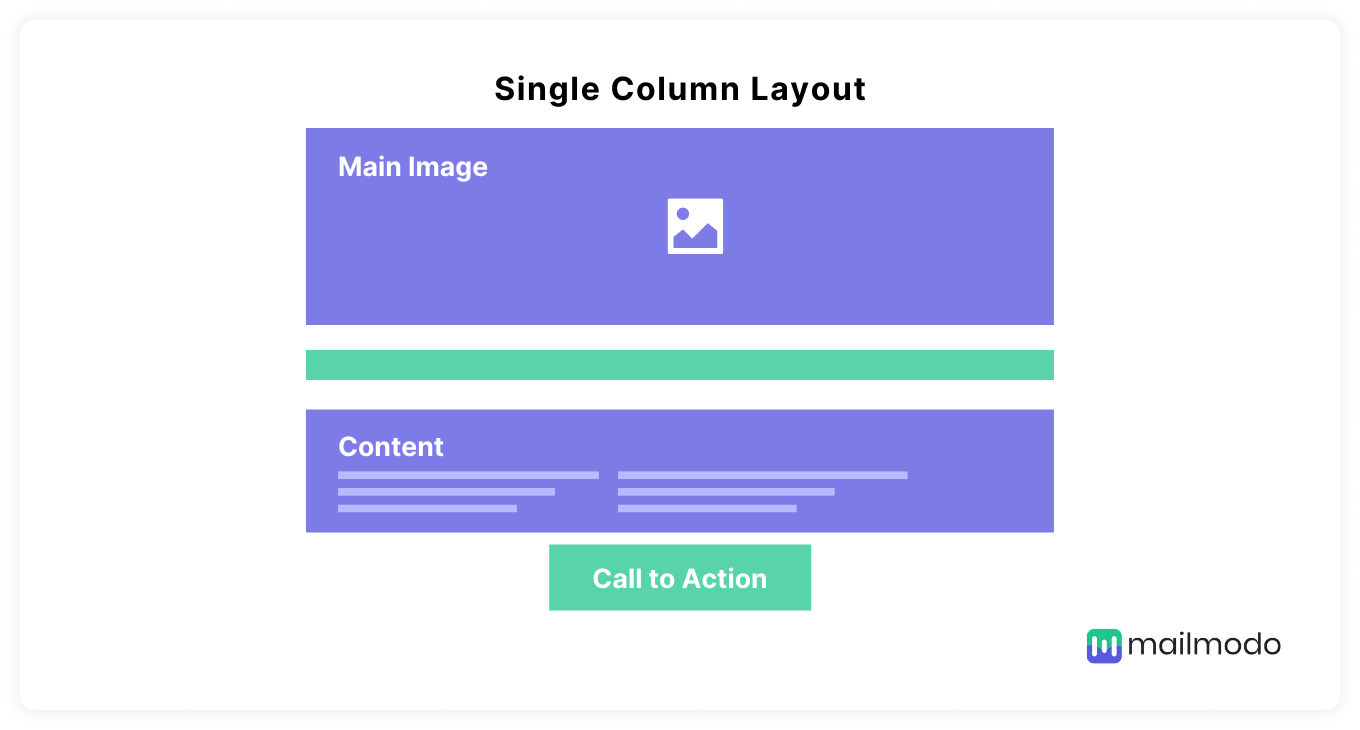
Single-column emails have all the content of the email laid out in one column stacked one after another. They are straightforward emails designed to help readers navigate the email without overwhelming them.
The single-column emails usually contain only one image or illustration followed by the content of the email, and the layout makes it clear what information is fundamental and what the reader has to do next.
Single column layout can be used for:
Pros:
It works great on desktop and mobile.
It has a clear hierarchy of information.
Cons:
It requires readers to scroll down the entire email to find information.
The text and buttons can look different based on which device it is viewed on.
Multiple-column layout
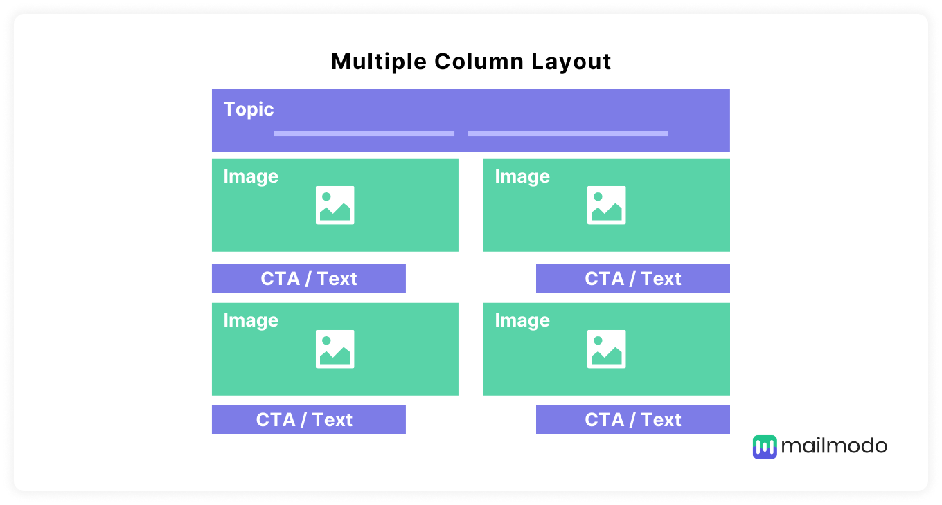
Multiple-columns layout in emails is when images in the email are placed side by side next to each other in two or more columns, followed by the email copy. This email design layout is often used by brands that focus mainly on using imagery in their emails.
Multiple column layouts can be used for:
Promotional emails
Product announcement emails
Weekly update emails
Pros:
It is perfect for an email that showcases options to compare side by side or display multiple pieces of content at once.
Cons:
It is not optimized for mobile devices because the columns get stacked one after another rather than side by side.
Hybrid email layout
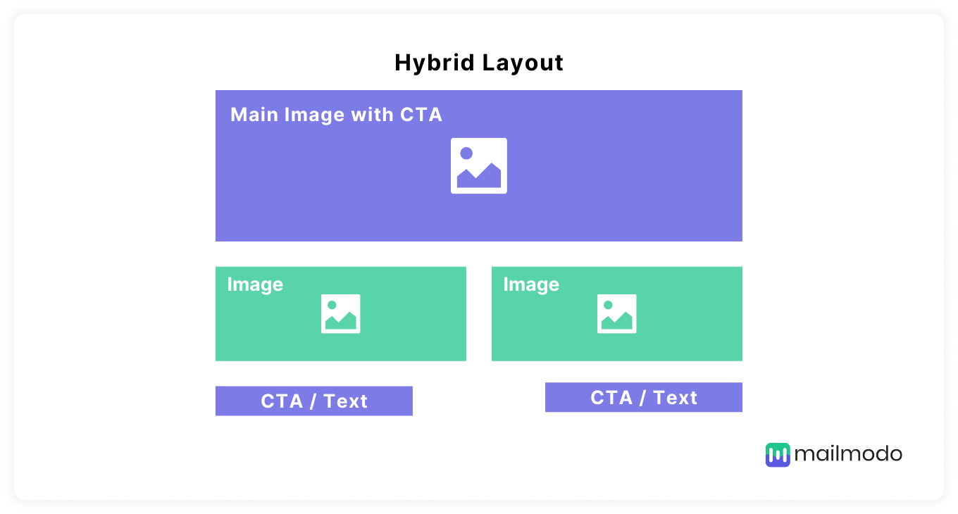
The hybrid layout combines a broad, single-column header that features the main offer or product, and several blocks underneath, split into two columns.
Hybrid layouts can be used for:
Announcement emails
Weekly update emails
Promotional emails
Pros:
It is perfect for showcasing the primary content with call-to-action followed by additional information with multiple calls to action.
Cons: It might have limits regarding the maximum width of the elements in it as it has to work for both desktop and mobile devices.
Inverted pyramid layout
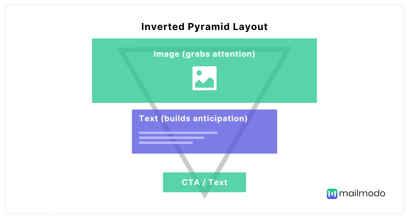
The inverted pyramid layout structures the elements of the email campaigns (header, imagery, buttons, etc.) to work together to lure people in, convey the key message of the campaign and make them click through.
In this layout, every part of the email is meant to support the call-to-action and eliminate any distractions so that they have nothing to do but click on the CTA button.
The inverted pyramid layout can be used for:
Onboarding emails
Promotional emails
Welcome emails
Pros:
It helps minimize distractions and maintain focus on the call to action.
Cons:
It is not useful for emails without a call to action like newsletters.
Zig-Zag email layout
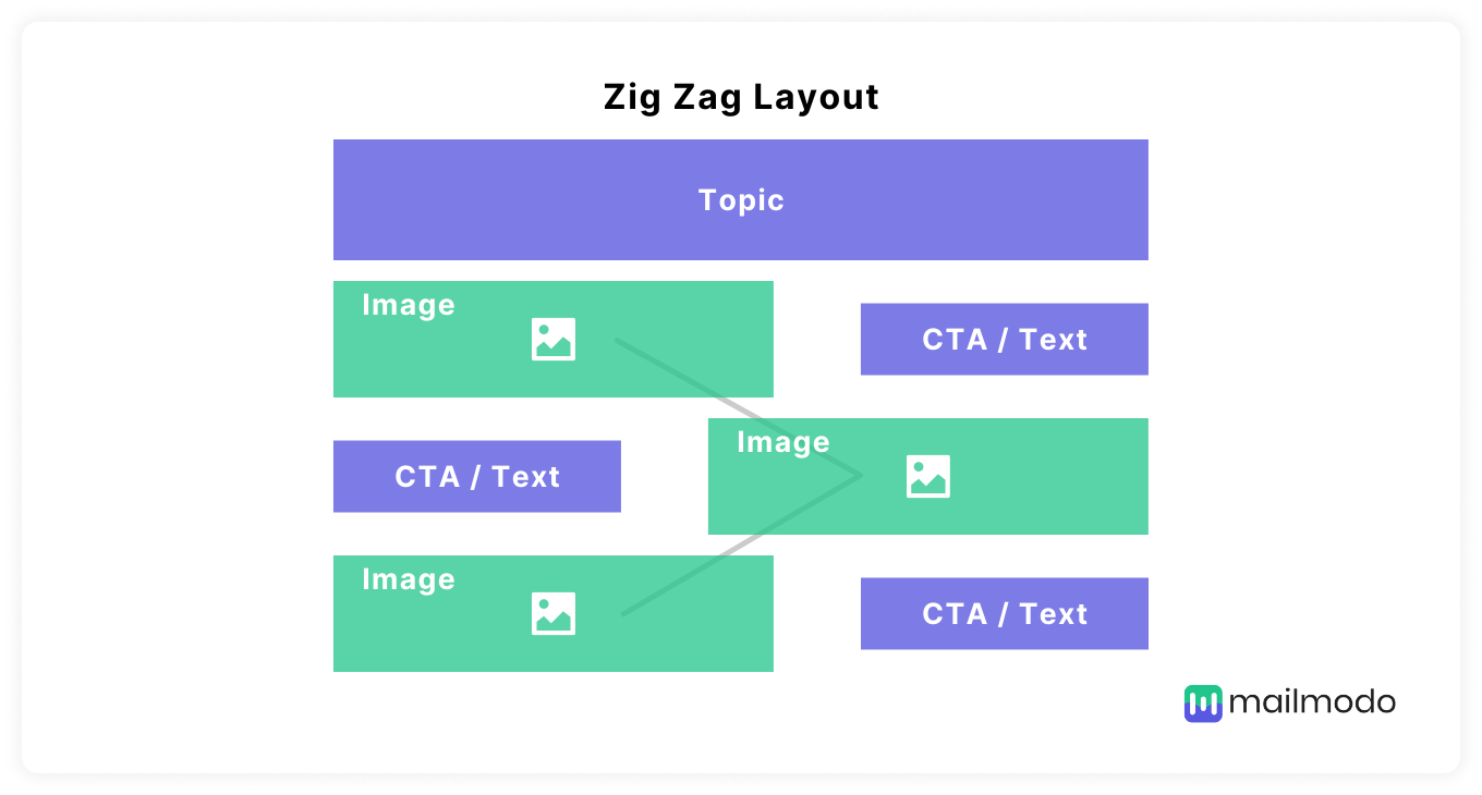
The zigzag layout is an angular layout that uses angles to create an enticing email design that is also functional and easy to read while containing a ton of information and graphics.
The zigzag layout can be used for:
Promotional emails
Product announcement emails
Pros:
It helps the eye flow through the email smoothly.
It helps break up the content into readable portions.
Cons:
It is not optimal for mobile devices and has to be optimized by the sender to be a responsive design.
It has limited application areas and can't be used to send different types of emails like welcome emails, newsletters, etc.
What's next
Now, all you’ve got to do is speculate what layout is best for the type of email you want to send and create a template with the layout.
If you don't want to create your template from scratch, you can find great pre-made templates available on Mailmodo.
Mailmodo provides templates for everything from conducting surveys to product marketing, and you can customize them to fit your needs.
Sign up for Mailmodo today!

