When creating an email, you mainly focus on creating a perfect email copy. But, as crucial as the writing is, there are other elements of an email, like email footers, that are just as vital, if not more, to get the most out of your emails.
An email footer might seem like an insignificant element, but it helps improve subscribers' interaction with your brand. Users typically go to the footer of the email to find the sender's name, contact information, unsubscribe option, etc.
If you don't have an email footer or don't know how to use it, then this is the guide for you. We'll help you understand the importance of an email footer and ways to use it to its full potential.
Table of contents
- What is an email footer?
- Why use an email footer?
- How to use an email footer to your advantage?
- What are the best practices to follow for a good email footer design?
- What's the next step?
What is an email footer?
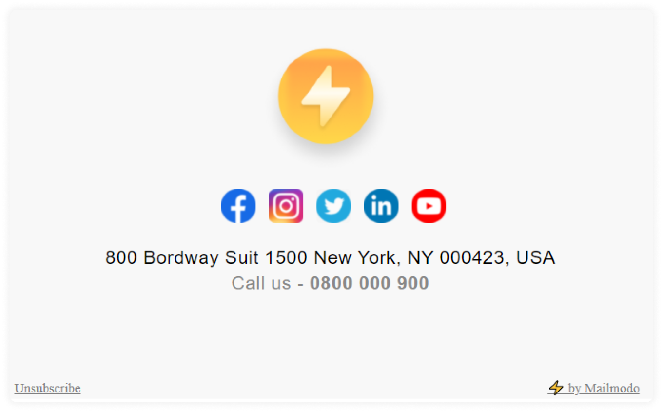
An email footer is the end of your email, which contains the unsubscribe or update preferences option, copyright (privacy or terms of use), etc. It is below your email signature where you sign your name and wish regards to the reader.
Why use an email footer?
There are numerous reasons why creating and using an email footer will always be useful for you, and here they are:
Using the footer, you can tell people about your brand objectives and motto.
You can use it to give readers a way to contact you by phone or email or direct them to your website.
They help you provide your subscribers with more information about the brand and even yourself.
You can provide them an option to update their preferences and get emails about topics they want to know more about.
How to use an email footer to your advantage?
Having a basic email footer is a good place to start. But if you want to make it more effective, you can do the following things to make the most out of your email footers:
1. Add the logo and brand motto
Adding your logo in the footer of the email can help increase your brand awareness. And the brand’s motto will tie it all together to be cohesive overall. You can even mention your brand’s value or missions in the footer of the email. The logo also works as a BIMI (Brand Indicators for Message Identification) as it helps people recognize your brand and trust the emails you send.
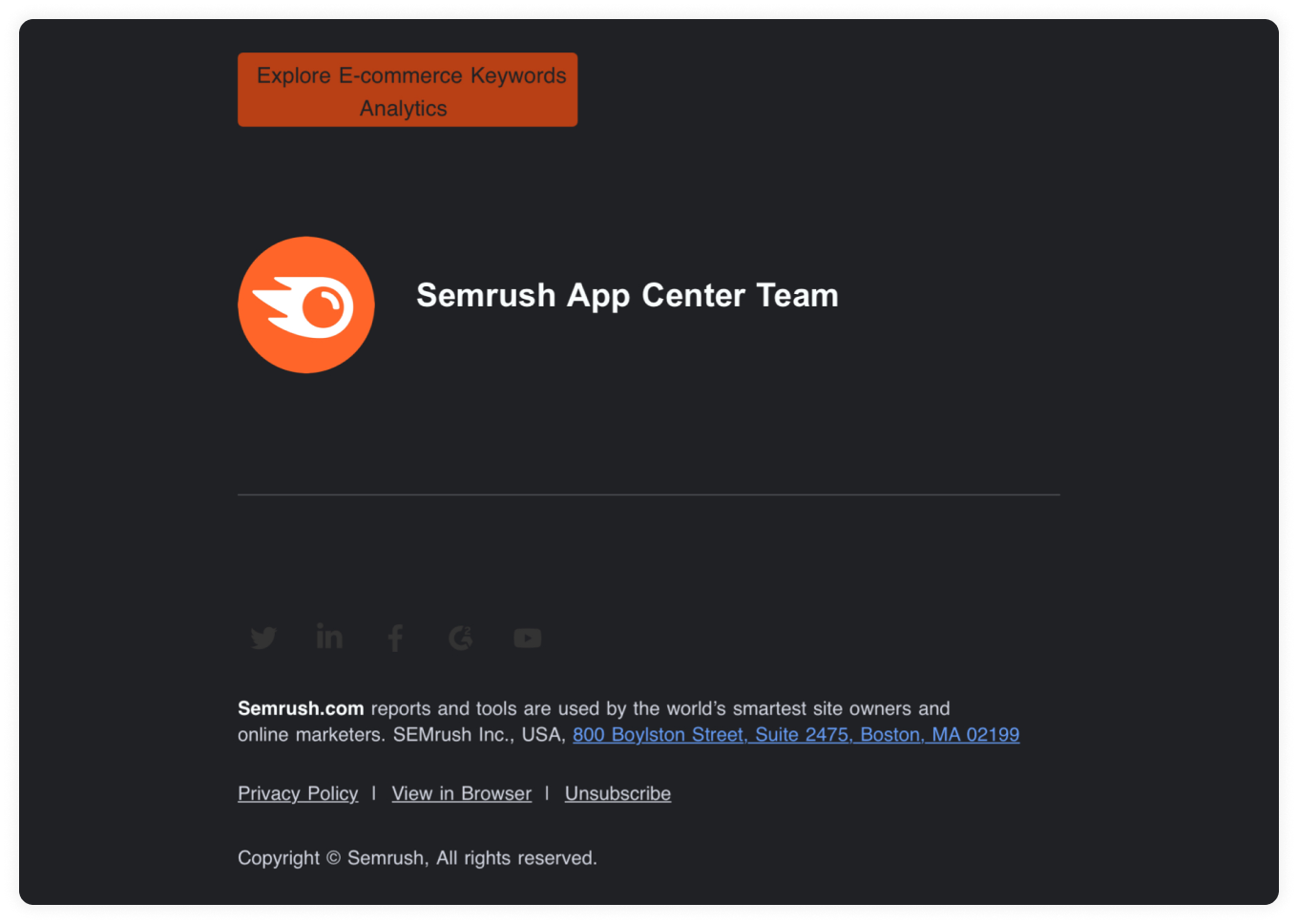
Here, Semrush includes its logo and purpose in the footer; it helps its audience better understand the company and its tools.
2. Insert a thank you note
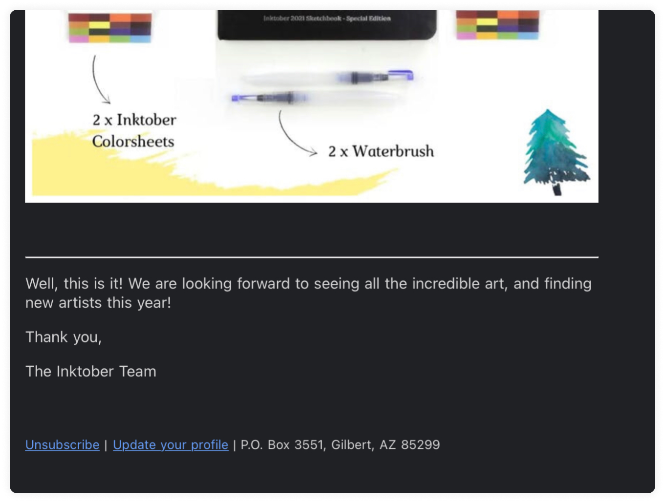
The footer is the perfect place in the email to include a thoughtful sign-off. Thanking your subscribers for their time can help strengthen your relationship with them just link the Inktober team did in their footer.
3. Link a lead magnet
If you have a lead magnet, you can link it in the footer and passively promote it. Ebooks, guides, checklists, webinars, cheat sheets, etc., are some of the most common lead magnets that are successful and provide value to your subscribers.
4. Add social media buttons
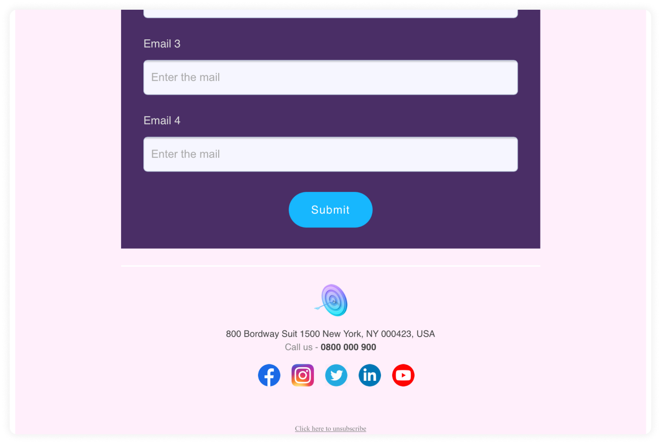
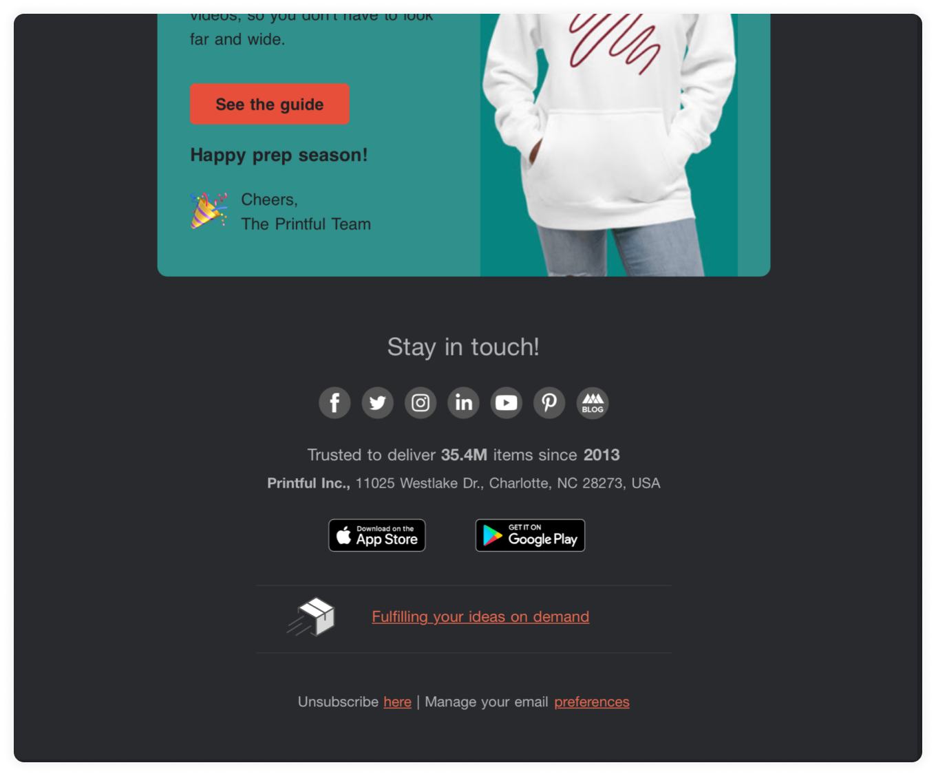
If your organization uses social media, then you can use emails to push traffic to your social media by adding social media icons to the footer of your email. Instagram, Facebook, LinkedIn, Twitter are some social platforms you can add to the footer.
5. Insert app install option
If your organization has an app, then you can link it so that people can directly download it from the link. Make sure you provide separate links for Android and Apple devices if necessary.
6. Insert email rating option
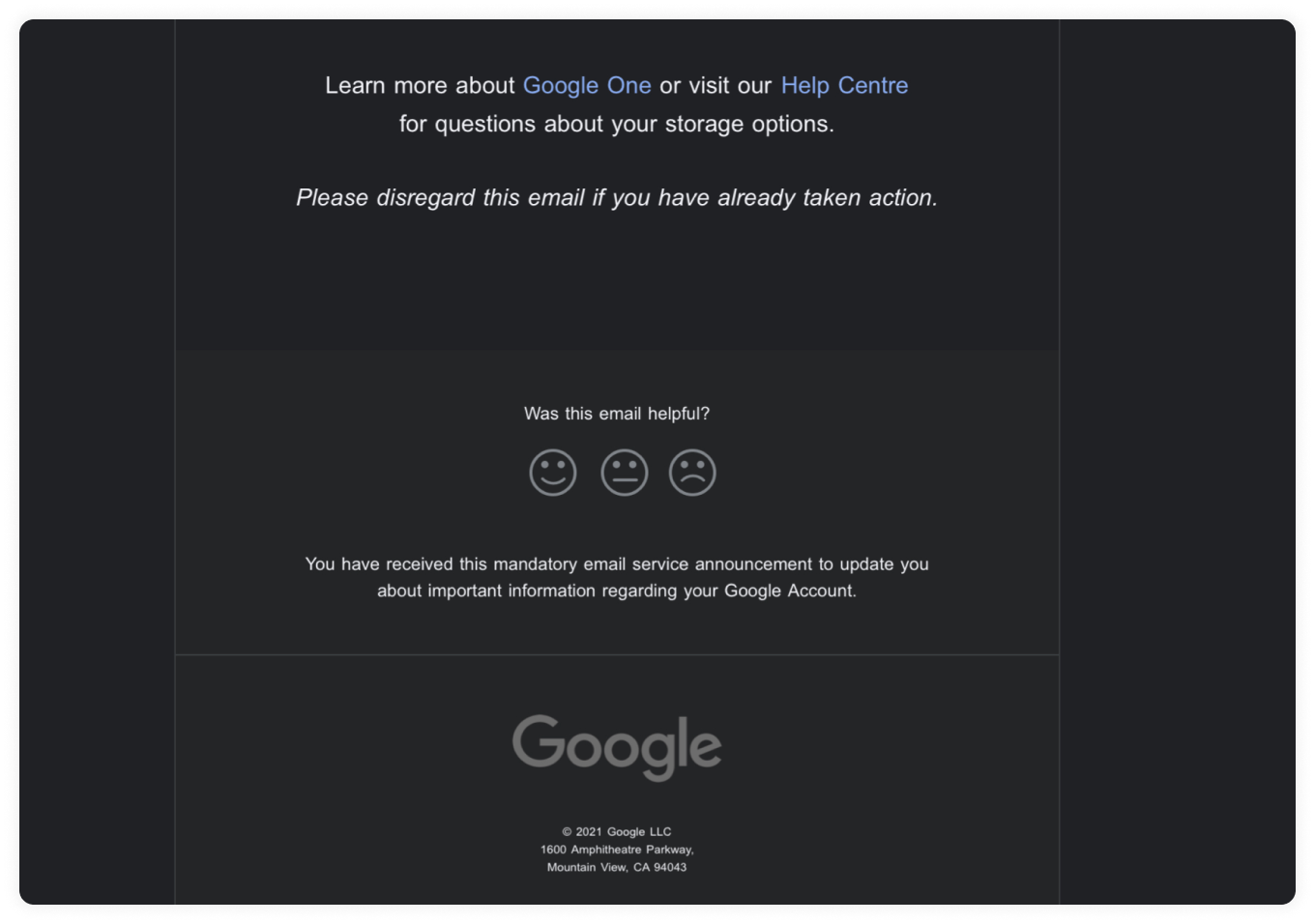
You can offer rating options in each email to get feedback on which type of email your subscribers like to receive. You can even provide a choice for readers to whitelist you so that your emails always reach their inboxes and never go to spam.
7. Transitional tonality (service to a product or vice-versa )
If you are a brand that primarily provides a service, but you want to transition to delivering products as well, then you can use the footer of the email to integrate it into your marketing emails.
What are the best practices to follow for a good email footer design?
To avoid a cluttered footer design, provide little information and keep things simple.
Keep the unsubscribe link accessible and easy to find.
Differentiate the footer from the body of the email with a different color.
Make the information more legible by leaving space between it.
Check out our guide 14 Email Design Best Practices to Ramp up Your Email Game in 2022, if you want more email design best practices.
What's the next step?
Now that we know how to construct effective email footers, it's time to get started on creating your own. You can use email service providers like Mailmodo to create a footer with the components that you want to include.
Mailmodo gives you the ability to include links, social media buttons, images, etc., in the footer of your email. You can even create custom email campaigns with different footers to see which one shows better results.
Sign up with Mailmodo today!

